This is the redesign of the place where Tradera sellers and buyers manage their transactions, payments, and shipping. This was a collaboration with two other designers to cover multiple design and product teams. I drove strategy and interaction design.
Feature coverage. The previous My Tradera had a decade’s worth of feature creep. We needed to figure out what to keep and what to cut.
Reduce complexity. The workflow, even for common tasks, is convoluted and requires digging through complex menus with many options.
Mobile first. Tradera had a huge influx of mobile users (growing 75% in two years), so we wanted to optimize for those devices.
Desktop strategy. We needed to make a decision whether to just use more screen real estate, or to develop desktop-specific functionality.
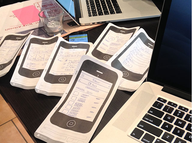
Brainstorm. Mathias and I kicked it off with an offsite design session. We then plastered our concepts all over the walls, then started grabbing people and riffing off our ideas. Later, we followed up with structured design sessions.
Engagement. Involving the entire team early helped engineering with estimation and risk assessment. The brainstorming sessions netted us some strong interaction ideas that eventually became fundamental parts of the interface.
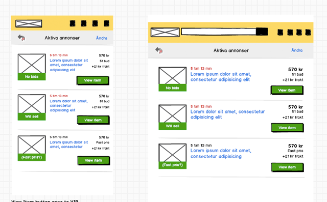
Rapid iterative prototypes. We started with mockups in Balsamic and them moved to testing mobile clickable prototypes in Sketch and Marvel. We progressed to live betas, with the teams taking turns implementing global features.
Constant feedback. Every time we started a new feature, we asked customer support what we could do to reduce their calls. Every prototype or product release was vetted by other employees, semi-formal usability and A/B testing.
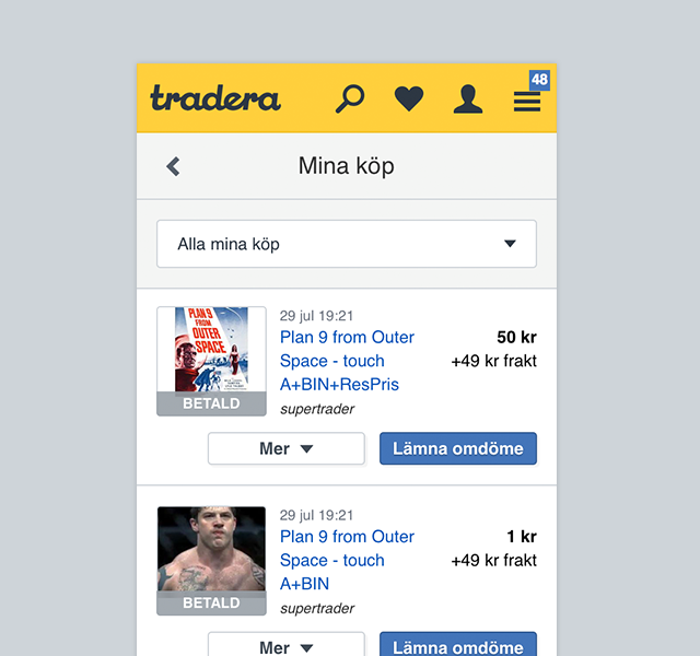
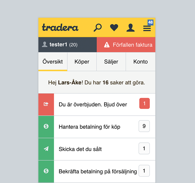
Leaner design. We stripped out a lot of features, and customers didn't miss them at all. Our new simple approach, bolstered by the 'To-Do List', does the job better than the old site ever did.
The Happy Path. We optimized the buying and selling flows to make the vast majority of transactions happen by selecting the most obvious option. Edge cases are cleaned up and revealed only in the proper context.
Mobile. The new 'To Do List' covers everyone's needs when they're on a mobile device, by sorting, prioritizing, and bubbling up the most pressing tasks right when they need them.
Desktop. Buyers don't use desktop any differently from mobile. Sellers, however, do a lot more specialized tasks, so we created more powerful sorting, filtering, and batch processing tools for that platform.
For mobile, we erred towards solving common tasks easily, and for desktop we erred towards enhancing power and productivity.
Customer delight. Our usability and A/B testing results validate our principles. People have taken to the new features, and our feedback is overwhelmingly positive.
Internal satisfaction. All Tradera employees sell and buy on the site, and we're as excited to use the new My Tradera as our customers are. We can't wait for the final release.