
I designed the layout grid used across all eBay web properties. This case study covers the challenges, research, and design behind the system.
Consistency. We wanted to bring a more stable, uniform appearance across eBay.
Ease. Studies show strong grids increase ease of use, retention, and legibility.
Speed. Structured layout code is much easier to repurpose and reuse.
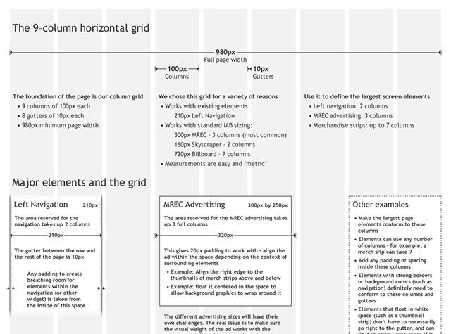
Constraints. We were incorporating more advertising in eBay, so we needed a system that could handle a few popular IAB ad sizes. The left navigation was too complex to refactor, so we had to keep that region very close to the same width.
Challenges. A wide range of teams with different reporting structures would be implementing the grid, so to be adopted, it needed to focus on solving a small number of immediate problems, and clearly save them time and effort.
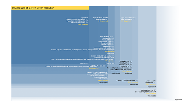
I needed some grounding, so, I started by gathering data on our site visitors. I created the infographic above to help me visualize what types of devices were being used, at what screen sizes, and to see what sort of implications I could draw from that. Does anything here influence the design?
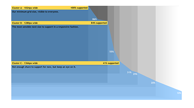
I then took each resolution and measured how many people we 'lost' as screen sizes went up. I then tried to see if there were any patterns that would make sense to influence a grid design. If we start designing for bigger screens, how many people actually benefit?
The final thing that clicked was as I was shopping the problem around to various engineers, one of them griped about odd pixel dimensions. I forget the exact numbers, but he said:
"I never remember column widths because they always break down into some oddball number like four at 157 pixels and one that's one pixel off. So I end up winging it."
It then hit me: what’s a nice, round number that is big enough to fit a 203 pixel wide nav bar? 210 pixels.
You know what adds up to 210 pixels? Two 100-pixel columns and a 10-pixel gutter.
You know what makes a numbers-driven system easy to remember and use? Being divisible by ten.
Bingo. We went metric.
Testing. I beta tested the grid in my own work for a while and found that it worked perfectly. Our layout-heavy screens all fit into the 7-column content area with minor adjustment.
Future proofing. I fleshed out the grid to optimize the experience for larger resolutions. I documented two strategies - making the column 100px wide minimum and stretching to fill larger screens, or adding more columns dynamically at larger breakpoints.
Launch. We adopted the grid for all our teams' work going forward, distributed the documentation company-wide, and began training other design and engineering teams throughout eBay.
Adoption. This grid system was adopted by teams across the retail shopping experience, and continued to be used for years after I left the company. It did it's job as a transitional step to a responsive layout, and stayed in use until the 2015 redesign.